Arriving at Yokohama International School I was confronted, 2 weeks in, with our kick-off Back to School Night. The three of us second grade teachers crammed 50+ attending parents into one small classroom, on unfortunately petite chairs, and proceeded to stumble our way through a Powerpoint.
It felt stilted, like many of these sort of events. Being largely scripted by the content of our slides, parents left having likely little sense of who we -their children’s teachers- were. We certainly got no sense of who our students’ parents were.
While nights like these are framed as an introduction to the year, with a taste of its curriculum, philosophy and so on, in the end I believe most parents come wanting to get a sense of who the teachers are, and for teachers, the best takeaway possible is to begin building partnerships with your students’ families.
The next year was much the same. We added a few words and maybe a picture or two to the Powerpoint (as embedded below). But basically, we stood and fumbled along unsatisfyingly.
The next year a different directive came through. We were asked to meet with our students’ parents separately, in our own classes. The idea that the primary purpose of the night was actually meeting the parents had come to the foreground, and there would be no more hiding behind the Powerpoint, and the words of my peers.
At first I was intimidated. I hadn’t done it this way before and wasn’t sure how to play it. I took a look at our previous presentation and felt the weight of standing and reading through the slides.

A Sloppy Joe: Food that makes you feel as good as its design. From Joyce Godsey on Flickr.

A Bento Box: Food that makes you feel as good as it looks. From Taiyo Fujii on Flickr.
Then I recalled a great talk I’d been to some months earlier. My friend Christine had invited me to an evening lecture at the Apple store in Ginza to see Garr Reynolds, author of the much-lauded Presentation Zen. Garr spoke at length about design principles, none of which were particularly new to me in and of themselves. Simplicity, contrast, line, balance… I remember a particularly notable comparison between images of a bento box and a sloppy joe, and his continued analogy of how you feel once you’ve consumed one or the other. What was new about his talk was the application of these same design concepts to presentations. He asserted that reading from the screen was neither necessary, nor effective. Instead he advocated, as I understood it, for the use of beautiful, resonant images with key words only or no words at all. Images which evoked directly or through juxtaposition the sense of what you were discussing. For me, it clicked.
Recalling this, I started to get excited about reinventing my presentation for the parents that night. I adored the way searching Flickr by conceptual tags, associated with the content I wanted to speak about, brought up suggestions of creative, nuanced and evocative images, whose indirectly associated content I would never have come up with independently. I felt like I was collaborating in my image selection with all the photographers who somewhat abstractly tagged their art works. Using these images, with key words written in color-tones drawn from the photos, I put together the following presentation, as a backbone for my talk.
What followed that night was undoubtedly the best such evening I’d been involved in. The key words on the slides were more than enough to scaffold my talking points, and the beauty and sometime humor of the images created a much more personal and casual tone in the room. I was able to speak to the audience, instead of reciting the slides, and react to their responses with far greater flexibility and sensitivity. Combine that with meeting only the parents of my students, and I’m sure we both came away with a much better sense of who each other were than in years past.
Having changed my tack to this style of approach, I will never go back to a conventional Powerpoint format. Go Zen.
That was Zen. This is now.
Many apologies for the title of this post.
[pinterest]
There are such a wealth of digital storytelling tools out there, that it’s always a challenge for me to know which ones to suggest for my students. Today I decided to try an experiment. I took a series of a few photos, chose a range of tools, and decided to have a go at telling the same photo-story with each one.
I’ll go through them one by one and detail some advantages and disadvantages along the way. I’ve made a point of exclusively choosing free tools that allow for use of my photos, and can easily be embedded in this blog. Hopefully, this will enable me to find appropriate tools for my class, and maybe even support readers by outlining the scope of these tools for their own purposes.
The story I’ve decided to tell happened to me several years ago when I traveled through North Pakistan, en route to Northwest China, along the Karakoram Highway. A route as old as the silk road, through one of the densest, highest regions of the Himalayas, cutting a stripe through spectacular valleys, dotted by gorgeous, profoundly hospitable villages and full of the most remarkable hikes and treks I’ve had the pleasure to travel.
Tikatok
Owned by book retailer Barnes & Noble, Tikatok is a digital book-maker with three levels of complexity. It offers a fairly detailed degree of design control and, for a fee, you can add audio or order a printed version of your creation. After spending 20 or 30 minutes building the book, I went to embed it only to find that there was no full-screen capability for reading the embedded creation. The result is the profoundly difficult to read text below. To view it in a more useful version, you have to click on the link below and visit the file where it’s hosted on the Tikatok site.
Click on a link to access a more readable version.
Ahead
Ahead is a Prezi-like tool for creating zoomable presentations across an indefinitely expandable workspace. While significantly more versatile than Prezi (pieces in the galleries include full websites built on its platform), its interface also takes a bit longer to get ahold of and feels rougher around the edges. Once you get a handle on the basics it moves along quite smoothly and is very easy to share and embed. In consideration of the learning curves of my students, I don’t think I would be likely to introduce this one. It seems to have a lot of potential, and is still in beta. I think I’ll have another look in a few months!

Sliderocket
A whole other beast. Sliderocket is a very slick slideshow creation platform. Sort of like a fully functional Powerpoint or Keynote application, but free and online. It has free and pro versions, but even the free version is very full-featured with numerous themes and templates. It allows for files to be imported from Powerpoint, and has a full set of analytics. Easily navigable, it none the less includes clear tutorial material. In my quick play with it I felt immediately quite fluent and would certainly use it again.
As a note of appreciation, most of the tools used in this post were found on Alan Levine’s Wiki CogDogRoo, where he conducts a similar experiment, but using over 60 tools, some with very minimal degrees of difference. Thanks Alan!
[pinterest]
Earlier this year my partner and I began to consider what our next step might be along the international education road. To be fair, we came at it from a very cushy spot. We have great jobs in a great school. We love Tokyo and living in Japan. But part of this life we’ve chosen is about exploration, moving on and discovering new things. So inevitably we know we’ll eventually look elsewhere, be it next year, the one after, or somewhere further down the road. It’s a cyclically exciting time when colleagues begin announcing their destinations for the coming year and it always gets my imagination going.
So a few months ago I confronted the reality that if I was to consider a transition, I had to get my resume up to speed. I know myself. And I know that a little phrase like “get my resume up to speed” actually means days, if not weeks of fiddling with design and content until the beast is tamed. I also know that to update a design for me often means a complete re-invention.
I started by looking at the last CV I’d put together (below). Not bad.
The text was nice, the essential ingredients were there. It was legible and navigable, without looking like everyone else’s. Lovely pictures of some of my ex-students, brought back nice memories and made it clear that this was a document about working with kids. But I recalled an interview with a kind principal where she noted that though it was a great CV, she wanted to see the pictures in colour! It made me ask myself, why are CVs so dominantly black and white?
So the process began. I started to look at the many ways the idea of a resume has been reinvented over the past years. I looked at much-lauded dynamic digital resumes, as described here on Mashable. I looked at the self-promotion websites of other international educators, like my friend Sean’s and prolific edutech Langwitches blogger Silvia Tolisano. I even played with some infographic generator CV platforms, like visualize.me and re.vu. I was even quick enough off the block on the latter to nab the domain re.vu/jamie!

An infographic resume generating platform: re.vu
While I saw the benefits of all these ways of framing yourself professionally, I also decided that I needed to start somewhere, and that one element of these tools of self-promotion would inevitably the “traditional” paper resume. So, with color, design and content in mind, I started to build the friendly orange monster dwelling below.
I started with these considerations… It would have to be a design-intensive, but print-friendly document. Adobe InDesign became the tool of choice. It was likely to make it’s first impact on anyone on-screen, and so any interactivity would have to be hyperlinked. This required a platform allowing for a quality publication of a pdf file, which retained links and printability. Issuu won. I decided to maintain the lovely student images of the past, but couldn’t bring myself to make them full-colour from a design perspective, so settled on a warm rusty tone that complemented the orange and yellow visual elements. An added consideration was the addition of QR codes to allow readers with the print copy in hand to access materials with their mobiles.
Weeks later, it was ready to publish.
Months later, it already needs an update.
[pinterest]
Spending the last few weeks reading extensively about visual dynamics has been a very applied process for me. The story goes like this…

The elixir of grand/ridiculous plans. From HeadCRasher on Flickr.
Nearly two years ago, in pursuit of best practice insight into outdoor/environmental education I signed up for weekend workshop in Kuala Lumpur. The leader, Kenny Peavy, led an inspiring two-day session and I returned home to Tokyo committed to learn more. Months later, during a follow-up service-learning workshop back in KL, I ran into Kenny again. This time, he wasn’t running the workshop, so we had time to go for a few beers. And as with many grand schemes, this next one was concocted in the pub.
Kenny told me how he was looking to move full time into environmental curriculum consulting, and growing his NGO, The Environmental Education Association of South East Asia. So, in part to grease the transition, and to launch this NGO he had this crazy project in mind… He wanted to bike across South East Asia and make a documentary about environmental stories as he went. He had summer 2012 in mind.
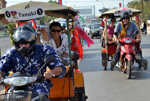
Team Tanuki tuks towards the finish line! From LARGEMinority on Flickr.
We spoke about it for hours. It didn’t strike me as crazy at all. For one, I’d recently completed a tuk-tuk rally driving 1100 kms around Cambodia. This in a vehicle that resembled a motorbike your grandma would laugh at, pulling a tin can chariot (see Team Tanuki & The Cambo Challenge for more). Plus if you had asked me ten years earlier what I wanted to do with my life, I would have answered without hesitation: environmental advocacy film-making, but I was too busy cycling around the backroads of Eastern Canada at the time. Seriously.
So over the following hours and drinks, I shared a lot of ideas about what I thought would make something like that work cinematically and narratively, and became progressively greener with envy. Towards the end of the night, Kenny popped the question… “Why don’t you come?”
At the time I yeah-yeah-yeah’d it and brushed it right off. But over the following weeks I found myself thinking about it more and more, eventually asking myself the question: “Well, why don’t I go?”
It’s quite possible that my email to Kenny looked like this: “I’m in. But what am I in by the way?”
And all this takes me here. Applied visual dynamics. I’ve become the production side of this traveling twosome. The website, graphics, cinematography, direction and editorial responsibilities are mine. I’m loving them, but it’s been a long time.
So over the past weeks I’ve been building our site greenriders.asia. We’ve gone through a good number of design generations already. It’s amazing, when you look at something as simple as the background for a site, how many variations I went through before coming up with the current one. Color, contrast, complexity, content. I think it took me four days to settle on the current burlap-chic. For a long while I was stuck trying on an enormous range of foresty leaf patterns. Clair Weston put that momentum to rest for me when she asked: “Why is there a cabbage in the background?”. I decided the leaves may not set the right tone.

GREEN Riders home page: Burlap 1, Cabbage 0
So I’ve been developing a visual aesthetic for this project. I feel like it needs to be scapbooky and hand-drawn, dominated by elements central to the journey. Bikes, tire marks, mud, jungle, travel, remoteness… Macro-themes and micro-themes. I know that whatever static design concepts I bring to the site are ones I also want to be able to echo in the YouTube video-serial I’ll be producing along the way. I know I want it to feel scrapbooky and intimate, without any of the dreaded iMovie tacked on slickness. I want it simple, playful and dirty.
So, my design challenge is this: To use WordPress tools to build a functional site that captures these energies, in a way that can be translated onward to film, and in aspects to Facebook, Twitter and more… Let me know what you think! (And don’t worry, I’ve deleted any suggestions of cabbage.)
[pinterest]
Note: I started writing this post over a month ago during my winter holidays, but things sort of got away from me and I had no chance to complete and publish it until now. Gomen nasai.
Personal Branding: What’s private, what’s public? I’m sitting here by the beach in Hoian, Vietnam. The surf is crashing, the surfers are crashing. The computer thankfully, is not.
It feels wrong in many ways to be thinking about personal branding and online presence while in a place like this, but that contrast is sort of where my thoughts are on it now anyways. The act of doing it illustrates elements of my thoughts and concerns about the act of doing it. In a previous post I started to reflect on personal branding, and particularly focused on that little square centimeter of screen-space, my avatar. I got some really interesting feedback and discussion out of it. Immediately, my friend Kevin asked the question: “Unless you’re selling something, is there a point in having consistent or meaningful self-branding?”.

Awakening the Fire, by Kevin Ledo
Kev is an artist, usually a painter, and has been pretty active in promoting his work online. In his work, he most certainly can benefit from online promotion, in finding his audience. Mine is different. As an educator, I’m not necessarily driven to find a broad audience. My main audience is my students. Until a few years ago for most educators it was our students, and perhaps our immediate peers, who would have been the only audience. But now, I feel those lines are not so clear.
This blog is a clear manifestation of the multiplicity of audiences. I write it as a reflection, for my own benefit, no doubt. But it is online. It is public. I value -and to a degree expect- interaction with others around these ideas. My blog is not a private journal. It may focus largely on subjects related to education, but the interactions and readership I’ve seen clearly stretch beyond that field, and issues pertaining to education are clearly of interest to a wider spectrum of people. As I wrote about here, the increasing ways in which my life unfolds online, through twitter, facebook, other communities and now this blog, means that inevitably there is a pressure of convergence between professional and personal life. Hence the illustration of my sitting on a beach putting down these thoughts. A personal time, given over to professional thought. The more online I am, in more and more ways, the more transparent my life becomes, and the more the professional/personal lines blur. Sort of whether I like it or not.
So, in answer to Kev’s question, I suppose that subject to the expectations of your profession, when you interact online you may end up feeling as though you’re always potentially selling yourself to a future opportunity. In education at least, it seems that the huge majority of employers use a range of online tools to learn more about their potential peers. And knowing this, I can’t help but consider them part of my possible audience. That doesn’t mean that I need to edit my work to meet their imagined expectations. But I expect that everything about me that’s ever surfaced online will be permanently available. Transparency is here, no matter what you may delete (check the Way Back Machine for a rude awakening), and I do believe that’s mostly a good thing. And so my brand, whatever that is, gets increasingly complex.

Branding may no longer be this simple, but I think it's just as permanent. But why those cowboys want to brand their dog is anyone's game. Image: The Branding Iron by Thomas Hawk on Flickr.
A sticky point for me is the term branding I think. I like the way Elif put it to me, as a misinterpretation or exaggeration of the idea of presentation. It may be semantic, but it sticks with me. The idea of my needing a brand seems disingenuous. The notion of a brand feels like a catchy way to summarize myself for a presumed audience. Concern about branding seems to suggest spending increasing time and energy promoting, contextualizing and positioning what I do, as opposed to just spending more energy doing it.
Branding for me was easier in the past. When you’d search for my name, there I was, right at the top. The rise of a certain senatorial candidate from Maryland put a decisive end to that prominence. For a while he asked me to put a link on the front page of my site (formerly at http://www.jamieraskin.com) and then, when I lazily let it lapse for a few days, he registered the domain. I was not pleased. But if I ever wanted something to bury references to me online, having a senator with your name helps a fair bit.
If my brand, such as it is, is inevitably going to come gasping to the surface, I feel the need to take it by the reins. [pinterest]
Subscribe to Many Hats...

many hats by Jamie Raskin is licensed under a Creative Commons Attribution-NonCommercial-ShareAlike 3.0 Unported License.


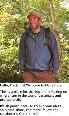
WELCOME TO MANY HATS